After making my post schedule I was conflicted about how to showcase each post on my blog, so I decided that the best way to go about it would be in the form of a log (which is this post) that I would add to my drafts and update after each post or series of posts, and publish it whenever my last post goes up, but before my critical reflection essay, for the sake of maintaining the appearance of posts on my blog.
10th April:
After the introductory posts, my first three posts followed the suburb theme.
For the first image, I head out for a walk in my colony with my camera and dragged my brother along to take evidence photos of me.
I took quite a few pictures, some of which I rejected including the swings picture, because even though the image connected really well the music video, the quality just wasn't up to the mark.
Another one was decent quality but I felt it would be too repetitive if I posted both this and the headlights one. As for the headlights photo, it took quite a few tries to get a lens blur and not a motion blur, or to avoid too much flare or too little flare, which naturally meant me pointing my camera at every distant passing car at 10 pm trying to not look like a creep.
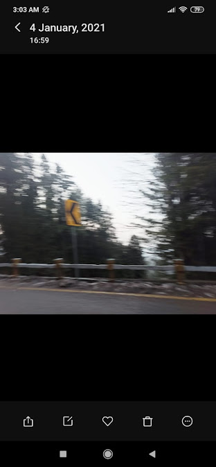
The second one is a picture I took back in early January when I went with north with my family for a quick weekend getaway. Since this isn't very recent and I had no idea I'd be using that picture, there's no photo evidence of me taking it but here's evidence that I was there and took the photo, as well as the original image because it was my phone camera and not a dslr, which meant I had to edit it a lot to get the final result:
The captions for these posts were also relevant names of tracks from the artist's album.
11th April:
These three pictures and video were taken on my terrace, the video was shot previously to be used in the music video. They were also relevant to the music video as it contained a lot of shots that involved natural scenery, and the flower motif itself is significant to the album and artist image as a whole.
The terrace (the sunset video was taken standing on the swing which is why its a bit shaky):
As for the second one, I just taped a flower from the garden to the wall. Here's the original picture that I took from my phone, and there's the wall (also on the terrace).
The captions on these were track names as well.
The next set of posts were the indoor/house-related pictures, all of which are highlight points in the music video. They were fairly easy to get - the window is where we shot the scenes in which the character appears to be waiting for someone (hence the caption for the post, which is also the name of a track - "muntazir" - which refers to someone who's waiting).
The party photo was a behind-the-scene evidence photo of when we filmed the party scene in the drawing room. The pink hue was also important because most of the party scenes had a pink hue to them due to the lighting, and the colour is important in the theme of the album.
The third one is a close-up of some sticky notes I stuck on my bed's headboard - there are several scenes that were filmed in the bedroom on the bed. I edited this image to make it more saturated and brighter to add an indie effect to it.
12th April (later in the day):
Now that these posts were done, I moved on to a set of "process" posts that would make the account seem a bit more personalised rather than too manufactured so the audience could connect more. FOr this purpose, I also tried to make the captions less "rigid".
Behold the artist's workspace:
13th April:
Like I did for the digipak's inlay, I made another liquified pattern on Photoshop and split the image into two columns and two rows for separate Instagram posts (i used an online site - pinetools.com). I posted two of these as the first and third picture in the row with the MV teaser in between to maintain the theme.
Now for the posts of real importance - I first made a short 17 second teaser for the music video on Premiere. The teaser showed short clips from all different scenarios and narratives shown in the music video that, taken out of context, don't seem coherent, which is what I was aiming for. There were some shots that I added that could stir some interest and/or curiosity in the audience to know the whole story, such as the pills in the cereal and the drink going backwards. I also used Adobe's own filters, specifically Fuji F125 Kodak.
I posted two countdown stories on Insta, one for the album release and the other for the MV release.
For the next row, which has a sneak peek of the music video as the centre post, I initially wanted to add the album covers as the side posts, however, I felt that it would be too repetitive since I'd already posted it and was planning to do so for a couple of posts later as well. Also considering accounts like Foster The People's they used several thematic elements for their posts instead of sticking to one, like in the promotion for their single Lamb's Wool, and later it's music video. So I went to Autodesk SketchBook, opened the image that I used for the digipak cover and on a new layer I draw an outline of it with white Inking Pen, and then duplicated the layer twice with lowered opacity and moved them away from the centre.
Since the post was for the announcement of the release of the music video, it was very relevant to the theme of the video and overall as well because of the flower and multiple layers motifs.
14th April:
I posted the final series of posts which included promotion of the artist in various forms such as holding a listening party following the album's release with commentary on the tracks on a radio channel that is quite popular in Pakistan and often plays music by new and rising artists. The second post was inspired by Abdullah Siddiqui's Instagram and I felt it was important to clearly out out the platform on which the artist would be releasing her music since I never really clarified to the audience except for YouTube.
The third post was for the artist being featured in a virtual live performance by a band. Virtual concerts and performances and gigs have been gaining popularity recently because of the covid circumstances, and are especially successful for newer artists because they don't have an established fanbase so since these lives are free unless clarified, it allows for a larger number of people to attend them and learn about the artist. Another reason was that the band is going to be the main artist performing so people who attend to watch the band will also learn of Hala.
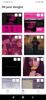
I made all three posts on Canva on my phone.
The colour scheme was kept consistent for all three posts and also with the overall theme of the album. They were important in order to create and establish the artist's presence online due to the restrictions in doing so physically by having, for example, appearing on shows, live concerts or fan-meets etc.


Comments
Post a Comment